Your product page is where the majority of your customers will finally make the decision between buying your product and leaving your store. Unfortunately, it’s an often-neglected part of the sales funnel.
While most store owners tend to focus on improving their checkout page or tweaking what happens after a visitor adds a product to their cart, customers won’t get that far unless you have a solid product page that converts.
Product pages exist to tell customers why your product is awesome and which of their needs it fulfills or problem it solves before they finally make a buying decision. Beautiful photos of your product and well-written product descriptions are important. However, there’s a lot more to a great product page than just that.
A great product page contains elements that inform potential customers, show social proof, highlight all the features and benefits of your product, and build trust between your visitors and your business.
To help you beef up your product pages, I’m going to share six simple-but-bulletproof ways to help increase conversions on your product page.
 Free Bonus: Download this free PDF where I show you four awesome product pages and provide a complete breakdown of why they work. This PDF will give you the inspiration and ideas you need to improve your own store’s product pages.
1. Add a Frequently Asked Questions Section
When customers are on the fence about purchasing your product, oftentimes it’s because they have unanswered questions. Including a list of frequently asked questions and answers on your product pages helps get them off that fence.
According to Optimizely, Roller Skate Nation increased their conversions by 69% when they added a FAQ to their product page. If you need inspiration on what a good-looking FAQ on a product page looks like, take a look at how Skinnyfatties, a tie slimming service, does it:

via Skinnyfatties
Look at the common questions you often get in your inbox and start saving some of the most frequent ones in a spreadsheet. You can even make up your own questions if you anticipate they’ll come up later on. This will also help decrease the amount of questions and emails you receive.
If you have many products on your website, consider adding a FAQ to the most popular ones, or those which you receive the most questions about. To add an FAQ section to your product page, check out the Shopify App Store or add your common questions with answers in the product description.
2. Integrate Live Chat
According to a case study by Forrester, Wells Fargo saw a double-digit increase in conversions when they added live chat to their website. Just like an FAQ on your product page, a live chat allows potential customers to get their questions answered, making it easier for them to make an informed buying decision.
Plus, a live chat lets your visitors know that you’re easily and quickly accessible, making your business more trustworthy. Even if your visitors don’t use the live chat, just seeing it can give them that added peace of mind.
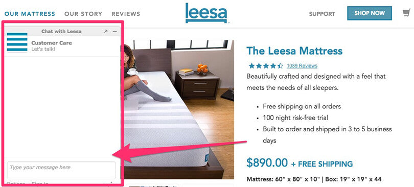
via Leesa
When your visitors do choose to use your live chat, that’s your opportunity to help them make a buying decision. You don’t have to be a salesperson; just be as helpful and transparent as possible.
For a more in-depth look at live chat integrations and how they can help your business, read our blog post about live chat.
If you’d like to add live chat to your product pages, be sure to check out the Shopify App store.
3. Display Product Videos
One of the biggest downsides of shopping online is not being able to to touch, feel, or physically examine a product you’re thinking about buying. When you go down the street to your local mall, you can touch products, better judge their size, and get a better sense of what owning the product will be like.
Pictures on your product page can only do so much. Often, a well shot video that gives a thorough look at your product can help potential buyers make those missing connections.
According to Internet Retailer, online housewares store StacksAndStacks, saw customers were 144% more likely to add a product to their cart after watching a video.
Your videos don’t need to be anything lengthy or complicated. Just look at how SlideBelts uses simple videos, with no audio, to show off their product better than images can:
 via SlideBelts
If you want to learn more about how video can help your ecommerce business, check out our comprehensive blog post on the topic. Adding videos to your product page could be as simple as embedding a video you uploaded to YouTube or using an app from the Shopify App Store.
4. Allow Customer Reviews
When a visitor has never heard of your business and lands on your product page for the first time, two things might come to their mind: 1. “Can I trust this website?” and 2. “Does this product deliver on what it promises?”.
Sometimes, simply allowing customers to leave reviews on your product pages helps ease these fears. When a new visitor hits your product page, they can read the reviews other customers have left about the product and be reassured of its quality. Plus, seeing that your business allows for reviews lets your visitors know you have nothing to hide.
Reviews on your product pages also gives your store social proof. It not only shows that people are buying and using the product, but that they care enough about it to leave a review. Here’s how MVMT Watches includes customer reviews on their product pages:

via MVMT
Ultimately, customer reviews on product pages are a good idea because they can help increase conversions. In a case study by Bazaarvoice, adding customer reviews to Figleaves.com’s product pages resulted in a 35% higher conversion compared to product pages without customer reviews.
If you want to easily allow customers to add reviews on your product pages, head over to the Shopify App Store and choose from one of the many review apps. As a bonus tip, follow up with customers a few weeks after their purchase and ask them to leave an honest review.
5. Prominently Display Badges or Seals
If your product is endorsed or certified by a reputable firm, let visitors know with a badge or seal.
Any certifications or important characteristics of your product (such as safety, legitimacy, officiality) should be included on your product page. It’s easy to simply write these things into your product description, but it’s far more effective if you can make these stand out as badges.

via Holy Crap
These badges and seals allow you to borrow the trust they might represent. This trust makes it easier for potential customers to want to do business with you. For example, in a case study by Internet Retailer, an online furniture retailer saw an increase in conversions by nearly 8% when a security seal was added to their website.
In some cases, you might need permission or need to receive an official letter/certificate to use specific seals or badges on your website. However, you can get creative and create badges for features of your product. For example features such as “Made in Canada” or “High Quality” would work better as nicely designed badges than simple bullet points in a product description.
To add badges and seals to your product page, insert images into your product description using the rich editor.
6. Offer a Rock Solid Money Back Guarantee
What’s your return policy? What’s your customer satisfaction policy? Is it hidden away on a separate page for no one to see?
Proudly display your money back guarantee and policy on your product page. If you’re willing to promise your customers that your product is the best, show it. If you put the risk on yourself, and give visitors more confidence, they’ll be more likely to trust you and in turn, purchase your products.
Neil Patel, co-founder of Crazy Egg and Hello Bar, claims he saw his sales increase by 21% when he added a money back guarantee. Here’s some inspiration on what a great money back guarantee on a product page looks like:
via Slyde
Slyde, a handboard store, is not afraid to dedicate an entire section of their product pages to their satisfaction guarantee. They understand that if they want first-time customers to trust them, they need to show visitors that they have a lot of confidence in the quality in their products.
You don’t need to be a designer to create your own eye-catching guarantee badge. Check out sometemplates over at Creative Market and make them your own so they fit your branding.
Your Turn
These are always things you should split test. It might be unwise to assume every suggestion offered in this blog post will always increase conversions on your product page. Each product, business and customer is different. Implement and test what you think makes the most sense right now and then evaluate after a sufficient length of time.
But don’t let that discourage you either! Sometimes, the smallest or simplest change can have a significant impact on your business. That’s why it’s so important to test things.
How about you? What’s the smallest or simplest change you’ve made in the past few months that has had the biggest impact? Comment below. If you have any comments or suggestions regarding this blog post, leave them below as well. I engage with and respond to everyone.